Previously I shared the women's spring colors. In part 2, I'll be sharing the men's spring color trends.
The first color selected is Lavender Herb. This is one of my favorites for the men and I sincerely hope that many men adopt this color. One of the things that I love about this shade is that regardless of personal style, this shade of lavender works for everything from preppy to Neo Victorian.
 |
| Photo courtesy of Pantone |
 |
| Photo courtesy of Pantone |
Titanium should be big for the gentleman this spring. It makes a great alternative to black for those warmer days (pretty much every day if you live in Texas)
 |
| Photo courtesy of Pantone |
Sandstone is next on the list. While Pantone may like this shade, it is one I struggle to get behind. The yellow/orange undertones makes this a color that I find harsh for many complexions.
 |
| Photo courtesy of Pantone |
Woodbine is a mossy shade of green. It reminds me of trees in East Texas where I spent my adolescent years. This is another color that won't work with every complexion, so try this one on...don't buy unless you LOVE it.
 |
| Photo courtesy of Pantone |
Toasted Almond...sounds more like something I would order for my ice cream sundae than a shade of clothing, but it is a lovely neutral. I can foresee many khaki pants in this shade for spring.
 |
| Photo courtesy of Pantone |
Classic Blue. The name says it all. This is a shade that looks good on practically everyone, so buy,buy, buy.
 |
| Photo courtesy of Pantone |
Treetop reminds me of a forest and makes me long for a cabin getaway. I love this shade of green and can't wait to see it on all those beautiful hazel the guys out there.
 |
| Photo courtesy of Pantone |
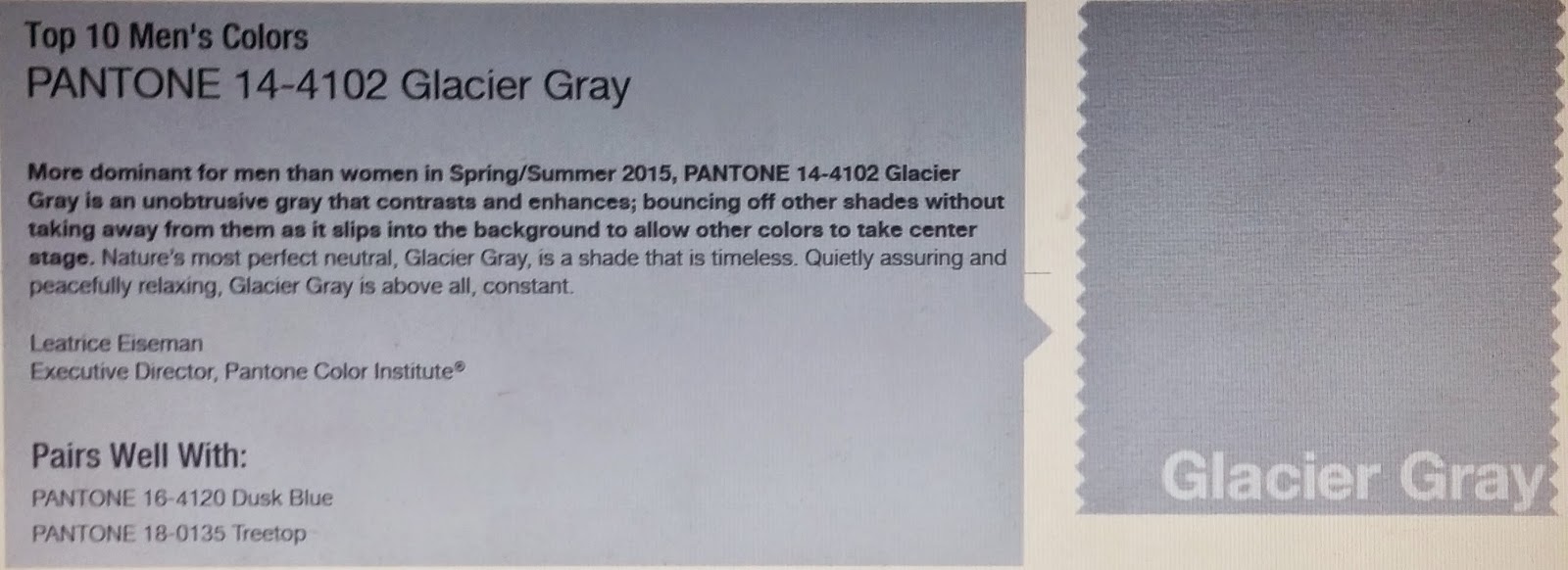
Glacier Grey, another great sprint neutral. Buy pants, suits, pretty much anything you like in this shade.
 |
| Photo courtesy of Pantone |
 |
| Photo courtesy of Pantone |
Post Title inspired by Rite of Spring from Angles & Airwaves